Role: Co-lead designer
Defining the Problem
The City of Austin approached us with a challenge. Can we get more residents in Austin to be civically engaged? Currently, the city hears from the same residents over and over, but decisions made at the local level impact everyone's life every day. How can we bring more people into the fold so that decisions are made inclusively?
Through research I conducted with my colleagues at the Austin Center for Design, we identified 3 key barriers that inhibit a person from connecting with the local government.
How could we bring awareness, help people build civic confidence, and also improve the channels to connect with the city?
Design Principles
Prior to designing anything, my partner and I created some design principles around these three opportunity areas to help guide our thinking process. We knew that in order to achieve any real change our design must account for the behaviors we observed during our research. For example, beyond simply creating awareness, we knew our design should bring awareness to people on topics that relate to their lives.
Based on our observations in the field, we developed the following guidelines. In order to be successful, our design must:
Alert people to topics that are relevant to their lives.
Give guidance on how to participate.
Offer information that is simple to understand and quick to consume.
Allow people to participate on their own time, keeping their effort to a minimum.
Prototyping the concept
Paper prototypes
Although the system made sense in theory, it was necessary for my partner and I to de-risk some major assumptions we had been making. Primarily, did people even want to learn about local government and the things government is doing in their city?
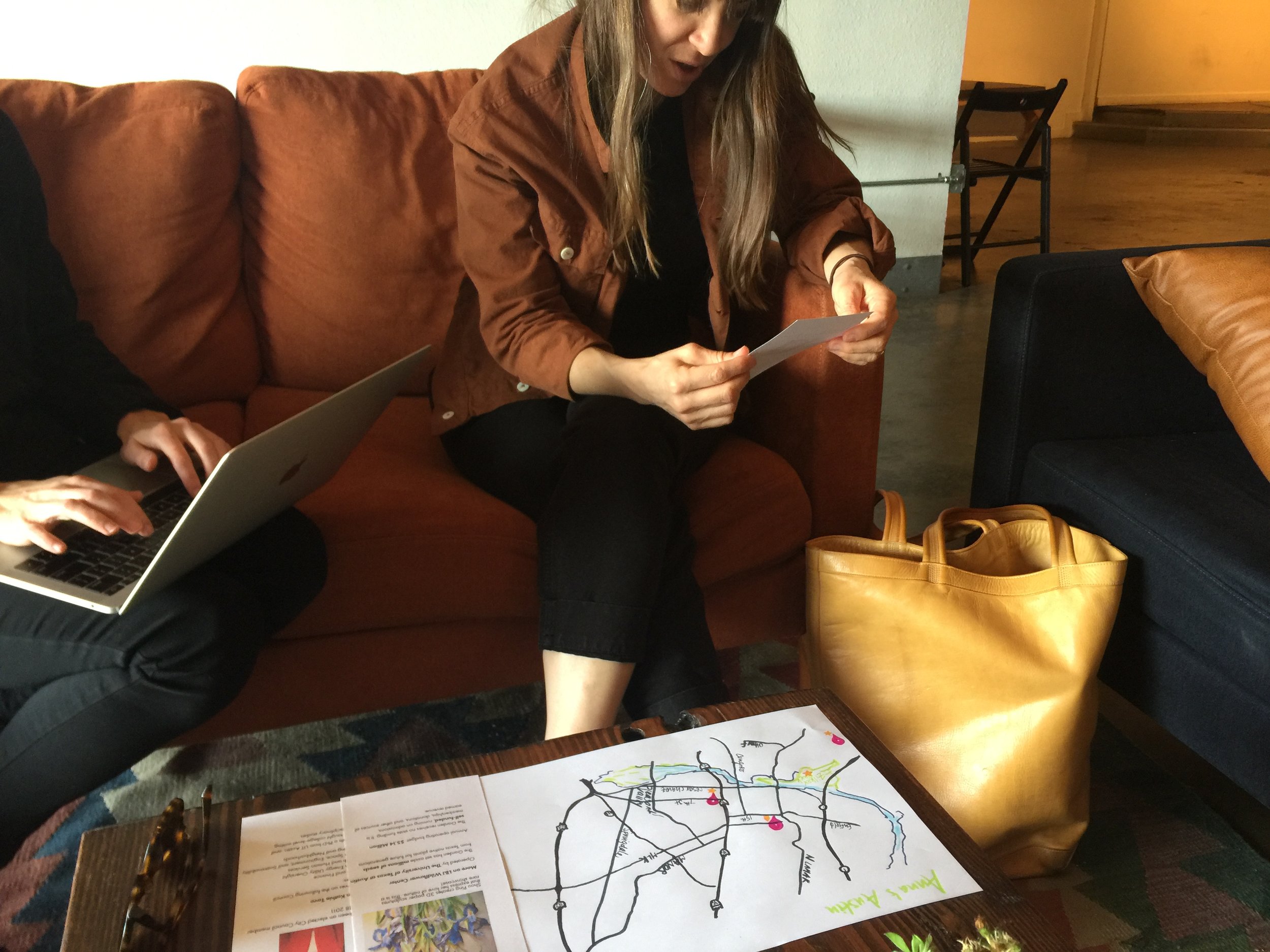
The first prototype we created was a paper version. We sent out a survey and invited residents to answer a few questions about themselves prior to meeting with us. We asked, where do live/work? How do you travel to work? Which places in Austin are important to you?
We created a set of personalized cards and a map for each participant based on their responses. When they came to meet with us, they could “click” on the map and read about something happening in Austin that bore a relevancy to their own life. They could learn about their district, their representative, and also projects happening nearby.
Some of the responses were:
“This is my representative? I had no idea he existed!”
“You’ve got me thinking. Maybe I should get more involved.”
Some of the content we shared didn't relate directly and we found that some people glossed over those cards.
LEARNING
Content that related to where people live, work and spend time sparked far more interest and helped participants build a connection to the city. We decided to focus in on creating this personalized experience moving forward.
Running a pilot
The next phase of testing took the form of a small pilot. We wondered how this same content would be received if we weren’t present for the user to have a conversation with - if the user wasn’t primed to listen and share. Would they still engage with us? Would they respond to an alert that is potentially disruptive to their day?
In order to test this we set up an SMS service in which we sent content out to 30 people over the course of 3 weeks. We were looking to measure their engagement level, and also their satisfaction level. Did they like receiving this service?
RESULTS
On average 68% of users engaged with our content by writing back with their thoughts or responding to a poll. However, the most surprising part was that even people who didn’t respond to our content still gave us a net promoter score of 8 or above (on a scale of 1-10).
“I love that I feel in-the-know and can start conversations with others.”
LEARNING
The Pulse of Austin is about more than civic engagement, it’s about being in-the-know.
This learning was huge, because it was an aspect we decided to capitalize on moving forward as we engaged with users and designed the experience of the app.
Designing the System
My partner on this project and I explored many approaches, but ultimately in order to best meet what we needed to accomplish, the concept pushed toward a mobile application. A mobile app allowed us to match the way people consume information, access content on their own time, and get alerts to new happenings in the city near where they spend time.
But how would it work?
I created a service blueprint in order to map out how the system will function as a mobile app and where within the service will it address the design principles we’d laid out.
The next steps were to start building the app. When considering where to start, I looked back at the service blueprint I had created and started with the key interactions we had identified and also our learnings from testing. How would that look in the app? I created a loose information architecture map of the app and starting building the core views.
Information Architecture
Key Views
EXPLORE VIEW
The Explore View is the primary place user can view new happenings around the city. When considering the hierarchy of information on the explore page, we reserved the top portion for the "latest happenings" so that users who want to be in-the-know have an easy place to reference.
LEARN
The learn view is one of the most important in the entire app. This is the section we pull users back to time and time again. We asked ourselves, how could we make content consumable, retain the users attention, and provide guidance?
PERSONAL CONTENT
The profile view is when users first learn about their district and representative. We utilized a map to help the user visualize their place within the larger fabric of the city, and they can also learn about happenings, similarly to the prototype, by clicking on areas of the map.


