Role: Lead UX Designer
The Problem
“How might we help musicians and music mixers collaborate on projects to more effectively produce music? ”
In order to create a music album, there are multiple people involved with different skill sets - musicians, vocalists, producers, and the person that is mixing the recording to achieve the desired sound. Currently however, the mixer communicates with everyone involved through multiple platforms: WhatsApp, Facebook, Email, Text, Evernote, and Dropbox. Because communication is spread across so many platforms, there are two main problems that occur.
1. Feedback is lost
2. Unproductive lag time as users navigate multiple channels
Goals
Store all feedback on a project that users can easily reference
Feedback interactions should feel conversational and fluid
Users should be able to easily reference songs and key moments in a song
Inspiration
What are the interactions of existing platforms that work well and would lend themselves to the type of interactions we seek with our own platform?
We really liked the way Facebook lets users respond quickly to a comment by “liking it” to show if you agree, and also that you can respond to a comment and your reply is shown to others as well. With SoundCloud, we liked the capability of leaving a comment as a timestamp, right on the soundbar of a song. Additionally we looked at how Spotify helps users create and organize playlists, and at how Slack helps users organize conversations through different channels.
Sketching Ideas
Before moving into digital, I always start by sketching wireframes. This serves as a thinking exercise, and is an even faster way to determine interactions.
Wireframes - Version 1
Next I organized the wireframes into flows, thinking of how multiple users might interact with the platform.
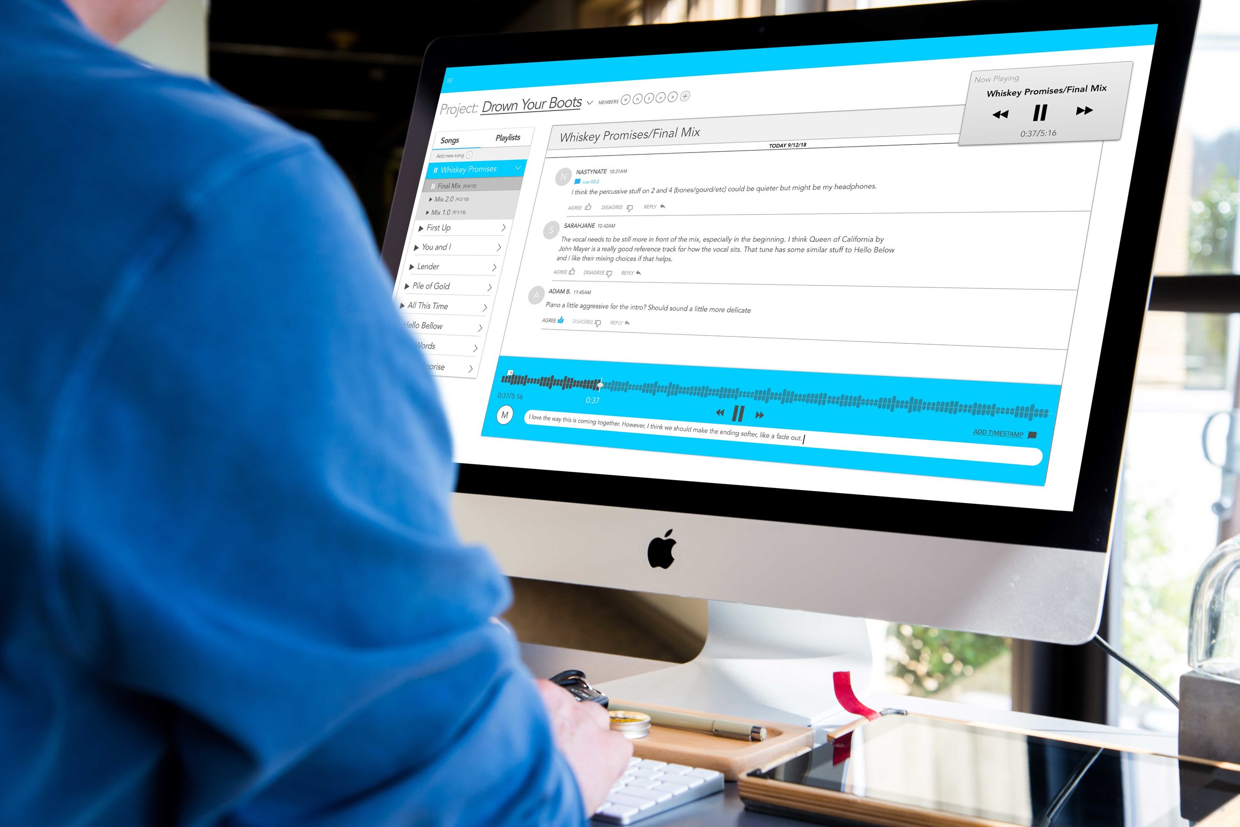
In the first round of wireframes I tried to focus on the chat interactions and making those as smooth and organized as possible. I put all the projects for a song on the left hand side and allowed the chat feeds to filter based on which song was selected. I also allowed songs to play on the playback widget independent of the the feed, so users to read and view feedback, while listening to various versions of a song.
Version 2
The first big change I made was to prioritize how music mixers need to create and work with various playlists that are complications of different versions of a song. To accomplish this, I decided to allow song and playlists to both live in the left sidebar and allow users to toggle between the two with a tab interaction.
Mobile View
Before we went too far with the webapp, we wanted to consider how the platform might serve users at different times in the work flow. For example, the person mixing the music, often needs time to reflect and listen to different versions of the song. They might listen in their car or while taking a walk. For this use-case, we wanted to explore a mobile version of the app, so make sure we are still delivering on the same goals of efficiency and conversational collaboration.
Mobile project view
Mobile Leave Feedback Flow
Mobile Create playlist Flow
Next Steps
This is an ongoing project and our next step in the process is to conduct usability testing before we go any further with designing screens and flows. We will do the testing with music industry professionals, those that would actually use the platform, and make sure to incorporate tests with both music mixers and non-technical talent on a project.


